
Color After Winter: Why We Crave Brightness This Time of Year
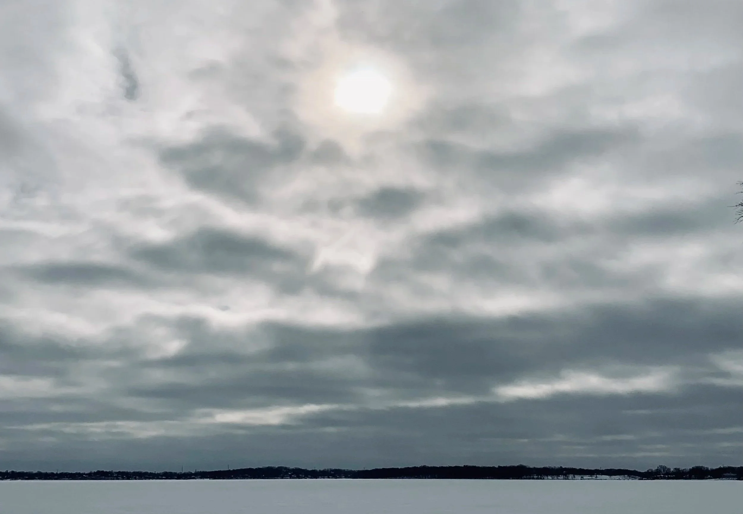
We aren’t officially done with winter here in Wisconsin. There are still mornings when frost clings stubbornly to the edges of the yard. But something is shifting outside our studio windows. The light lingers a little longer. The snow recedes in patches. And beneath the quiet browns and grays, there are hints, just hints, of green.
Every year, around this time, I feel it in my creative bones: a longing for color.
The Psychology of Brightness
Color psychology tells us what our bodies already know. After months of muted landscapes and shorter days, we begin to crave saturation. Yellows energize. Greens restore. Blues steady us. Even small doses of brightness can lift mood and sharpen focus. Our eyes and our spirits are ready for something more alive.
Winter is not colorless, of course. It has its own palette: slate skies, silver branches, soft whites. But by late February and early March, we begin to hunger for contrast. We want warmth. We want vibrancy. We want visual reminders that growth is coming.
That longing is not shallow. It’s deeply human.
Noticing the First Hints
Outside our Wisconsin studio, the signs are subtle. A brighter blue in the sky. The way the afternoon light hits the studio table suddenly feels generous.
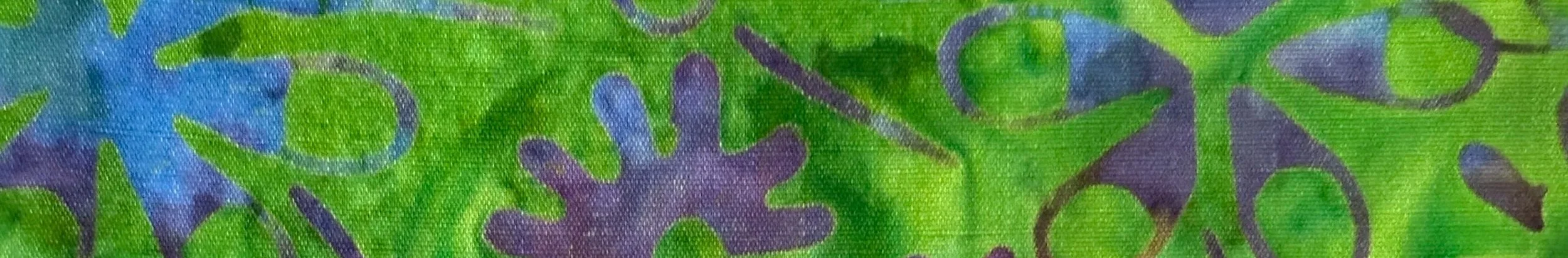
These small changes influence my work more than I realize. Fabrics that felt too bold in January now feel just right…especially as we look forward to Easter. Pinks seem hopeful. Greens feel grounded. Gold catches the eye with promise rather than extravagance.
Color becomes anticipation.
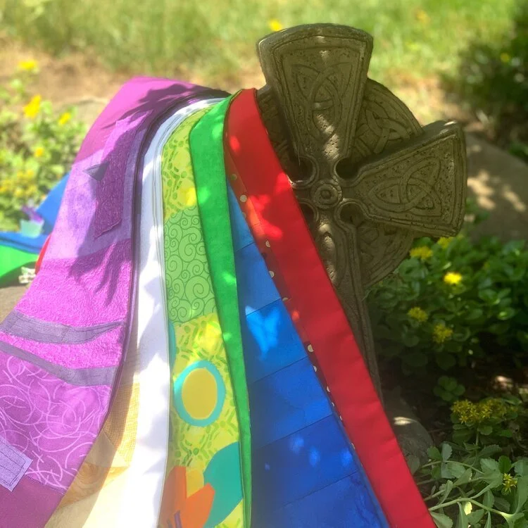
Carrot Top Studio and the Language of Color
At Carrot Top Studio, color has always been more than decoration. It tells a story. It sets a tone. It carries meaning.
In our clergy stoles and liturgical designs, color speaks even more intentionally. The church year understands what color psychology confirms: people feel what they see.
Purple invites reflection and preparation.
White and gold proclaim celebration and resurrection.
Red pulses with energy and Spirit.
Green grounds us in growth and endurance.
These aren’t arbitrary choices. They shape worship before a single word is spoken. They help congregations enter the season through their eyes.
Brightness as Hope
Perhaps that’s why we crave brightness right now. Not because winter was wrong, but because seasons move. The quiet of winter gives way to awakening. The subdued palette makes room for bloom.
We are on the edge of that shift.
As we move toward spring and toward the brighter colors of the church calendar, we don’t rush it. We simply begin noticing. We introduce color thoughtfully. We allow it to return gradually, just as the earth does.
And maybe that’s the lesson: color isn’t only about aesthetics. It’s about hope you can see.
Even here in Wisconsin, where winter still lingers, the light is lengthening. The palette is changing. And in the studio, we’re ready for what’s coming next.

Don’t miss out!
Subscribe and stay connected to the rhythm of the studio.
new product updates
free and discounted items
inspirational ideas